~Prototype 1: Notes~

For the first prototype, I went with a simple survey that was created with Google Forms and got great responses!

Coming into class, I was curious to see if people would fully understand the questions and answer them to the best of their ability. Before I allowed people to take it, I quickly added a section where people can place their comments and feedback as soon as they were done. After that, the survey went public and my peers filled it out with ease.

Once people took the survey, they also shared their thoughts about it in a small conversation. Overall the feedback was positive and constructive! My peers suggested that I take account that I should broaden the target audience to the elderly, rather than >25 years for a questions. Another suggestion was to break up the survey into different parts: Mobile and Desktop.

Moving forward, I will take into account what my peers have suggested to better the surveys so I can have accurate and interesting answers!

Prototype #1 Notes – Kris Hastings

For the first prototype meeting I had the general idea for what I wanted to do, some options for how I could present my final project, potential names, logos I made in Illustrator, and a few other few things. One of the most important aspects of my project is its level of helpfulness to other IMM students. I want to do this in a way that other students can take the steps I lay out and apply it to their own interests. To clarify, I’m focusing on how to start a video production company, but the “guide” that I will be developing over the second semester should be applicable to other interests such as graphic design, photography, 3D modelling, etc. It was because of this that I knew I wanted to ask my peers what they felt they would need help in the most of they were to start their own business. What I learned from this was that several of the people I talked to wanted to know more about the legal process of starting your own business. Another common area of concern is accounting, managing any money coming in or going out, and things of that nature. I also came into the class meeting unsure of how I wanted to present everything that I do. I was unsure for a few reasons. For starters, I don’t know if I will be able to get a room to present in, so I don’t know if computers will be available. Considering the videos are digital I decided that the educational side should be digital too, as opposed to having a big board that explains all the basic steps of starting your own business. Some of my classmates recommended putting everything on my own website, so I decided that was how I wanted to present, along with the social media pages and whatever physical products I make along the way. A cool way to do this, then, would be do have business cards with a QR code on them so that people can come in and point their phone camera at the code and it will take them to the website where they can see everything that I did. I realized through this that the website would have to be optimized for mobile use, so that became a priority for me. As far as my names and logos go, I got a lot of positive responses about the names, and I got a lot of good feedback about the logos. I learned a lot about font selection which opened up a few more doors for me. I haven’t fully committed to one logo yet as it is not a necessary component to do the rest of the project right now. However, I’m leaning towards something that relates to video in one way or another. This includes a camera, a slapboard, an LLC name with “Video” in it. I learned a lot about what people are interested in which is very helpful to decide on what I want to do with this project.
Gianna Pulitano – Prototype – Week #1 Experience

My first prototype was my beginning with the Raspberry Pi. I installed Noobs (Raspbian) onto my Pi and used a set up in the Ulab to attempt to light up an LED. The goal of this prototype was to understand the code to turning a source of power ON/OFF.

While following a YouTube tutorial, I learned how to successfully send power to the breadboard lighting up the LED. Unfortunately, I failed to link my code to the specific GPIO’s I was using making my code meaningless, possibly damaging the LED, and limiting myself from turning the LED off. (yay)

Through this experience with the Pi, I think I have developed a better understanding of the relationship between the different pieces of hardware I am using. I am still struggling to get the Pi to respond to some of my code but the feedback I received about adding in a “Sleep” command seems to be the solution to my issue of the never-ending LED.

Once I am able to completely control my Pi, I plan to try applying the Wi-Fi outlet I purchased and seeing if I can light up a source using that before transitioning to my water pump.

Prototype Week 1

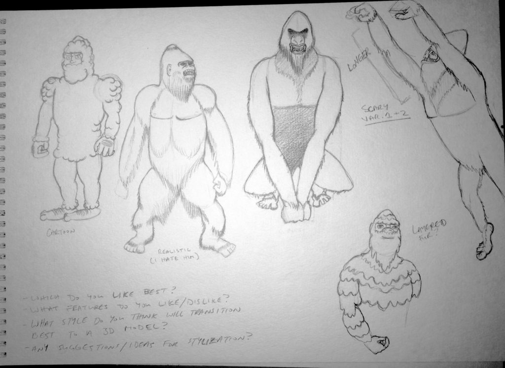
This week I worked on initial design sketches (image below) for Bigfoot in order to generate feedback on which style audiences were most receptive towards. I drew Bigfoot in a cartoon, realistic, and scary style and asked feedback questions like “Which do you like best and why?”, “What features do you like or dislike?”, “Which style do you think would transfer best to 3D modeling?”, and “Do you have ideas for styles not represented here?”. I had hoped that by asking these questions I could come to a consensus on how I wanted my cryptids to be presented, an issue I have been debating with myself the last few weeks. Overall feedback was positive and I learned a lot about my own project by seeing it through someone else’s perspective.

I kept a running tally of audience votes for favorite style and the end results were one vote for scary, three votes for realistic, and four votes for cartoon. Most people were torn between cartoon and realistic, and often asked what kind of audience I was hoping to attract to my game. If I wanted children to play it, it would be best to avoid scary styles. If I wanted a serious representation of cryptids, I should avoid cartoony. Most of the student feedback was leaning towards using the realistic style. However, Ault’s insight that most portfolios of 3D models include ones that looks like the scary and realistic styles made me rethink which would be best for the long term, and I decided to use the cartoon style for the museum instead to set my work apart from others. Feedback also taught me that the way I represent Bigfoot will also affect how I create his gallery room – if I went with the scary version, I would need a room with stylistic choices, objects, and lighting that reflected that.

Eric Branchek – Prototype 1

For my first prototype, I was able to retrieve several MIDI files containing music from some old video games, write the base code for the program, and feed it the MIDIs to generate my first piece. The end result was a MIDI file containing 500 notes containing the same pitch, which was not what I intended. However, this allows me to continue with my plan this week of tweaking the code to make it work.

One thing I did notice that would help me would be having a dedicated machine to train my program, because training it on my laptop was painfully slow. I plan to set that up either this week or the following one, just so that training will go much quicker.

Research Update 2

I’ve been doing a lot of research on what I am going to use and how I am going to start this project. I am a bit skeptical since I don’t have too much knowledge with coding especially with new languages. Not sure if I am using C++ or C# yet, but I will be using Maya, Unity and possibly Blender as well. I have found some helpful resources through text books, websites, and friends with experience in these fields. I am looking forward to a challenge and definitely won’t have any time for breaks.

I am going to be creating 3d models in Maya of the first couple of pages of my life, starting from when I was a kid to around my age now. Each page will be a different age to show what it was like growing up as an artist, especially in my family of business people.

I will be learning Blender since I don’t have access to 3ds max without a PC. This will help create the detailed 3d objects so my projections through AR will be strong and crisp. Not sure how to start writing the scripts for Unity, but I will start off with all the models from scratch along with a storyboard.

Prototype 1

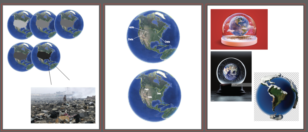
For my first prototype I thought of possible ideas how I want the globe to look. I found this video of projection mapping on a globe that I’m hoping to create something similar to.

This video demonstrates the same concept of the first video with different types of visualizations. When I show the audience about the stress on the earth that electronic waste shows, I want my visuals to be similar to this as a video/more realistic picture.

Here are a few ideas of how the data could be shown on the globe at different times.

I’m hoping to see this globe at the Comcast center in Philly for my industry event. Even though it’s not an event itself, it includes projection mapping in a sphere shape that’s interactive.

Prototype 1 – ” Poster Compositions”

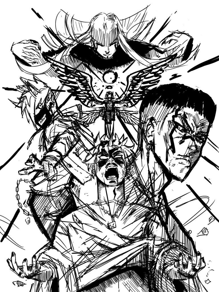
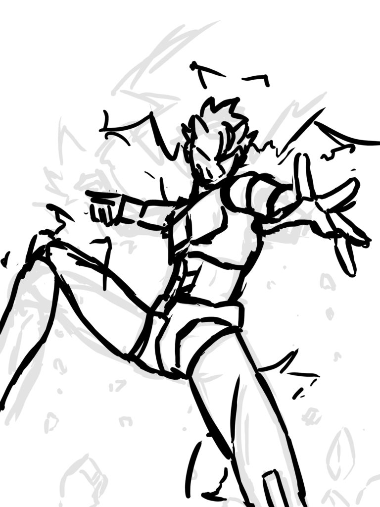
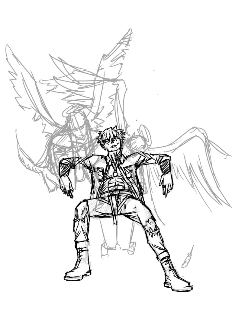
“Test one will look at different compositions of property-related artwork, for example, the composition of splash art. I will do quick sketches to compare the ways art is presented in splash art of (a) character(s). Here I will be trying to find the best way to express a sense of story and action within a single snapshot.  “

For this composition, I chose to do a character cast oriented sketch that focuses on a group of characters rather than a single subject. This would be a method I would use If I decided to do one poster rather than one for each character as the format has the potential to encompass the gist of an entire story. Drawing it was quite fun, and I took a lot of inspiration from posters I’ve seen In the shops around Akihabara during my research trip to Tokyo.

This basic sketch is what I would consider being the opposite of the previous, as it focuses on a single character rather than a cast. What I Like about this format is that it allows for more personality to be shown from each character and can be used to display what each is about in a single snapshot. It further allows gives more opportunity to foreshortening techniques. Marketing wise, Single character posters can cater better to niches within fandoms and may have more sales potential I may think.
For my final sketch, I decided to test a more ‘artsy’ feeling composition. A simpler more basic composition that could be useful for the cover art of a book or even a poster aswell. The angle is more direct and leaves room for the application of marketing text compared to the other two. I feel its closer to a simple, American style movie poster format than a one for Japanese IP.