For my first prototype I thought of possible ideas how I want the globe to look. I found this video of projection mapping on a globe that I’m hoping to create something similar to.
This video demonstrates the same concept of the first video with different types of visualizations. When I show the audience about the stress on the earth that electronic waste shows, I want my visuals to be similar to this as a video/more realistic picture.
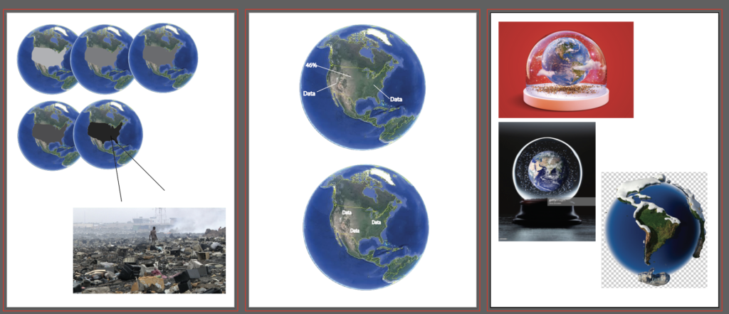
Here are a few ideas of how the data could be shown on the globe at different times.
I’m hoping to see this globe at the Comcast center in Philly for my industry event. Even though it’s not an event itself, it includes projection mapping in a sphere shape that’s interactive.