“Test one will look at different compositions of property-related artwork, for example, the composition of splash art. I will do quick sketches to compare the ways art is presented in splash art of (a) character(s). Here I will be trying to find the best way to express a sense of story and action within a single snapshot. “
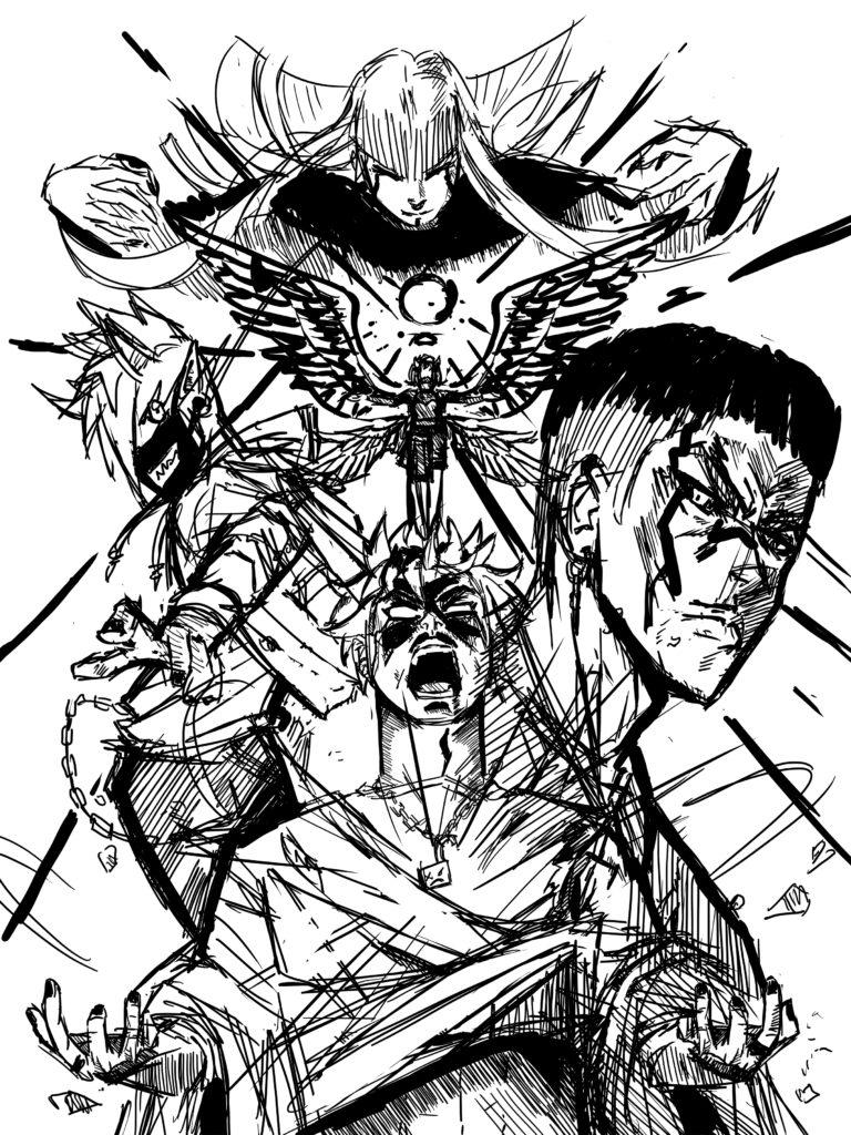
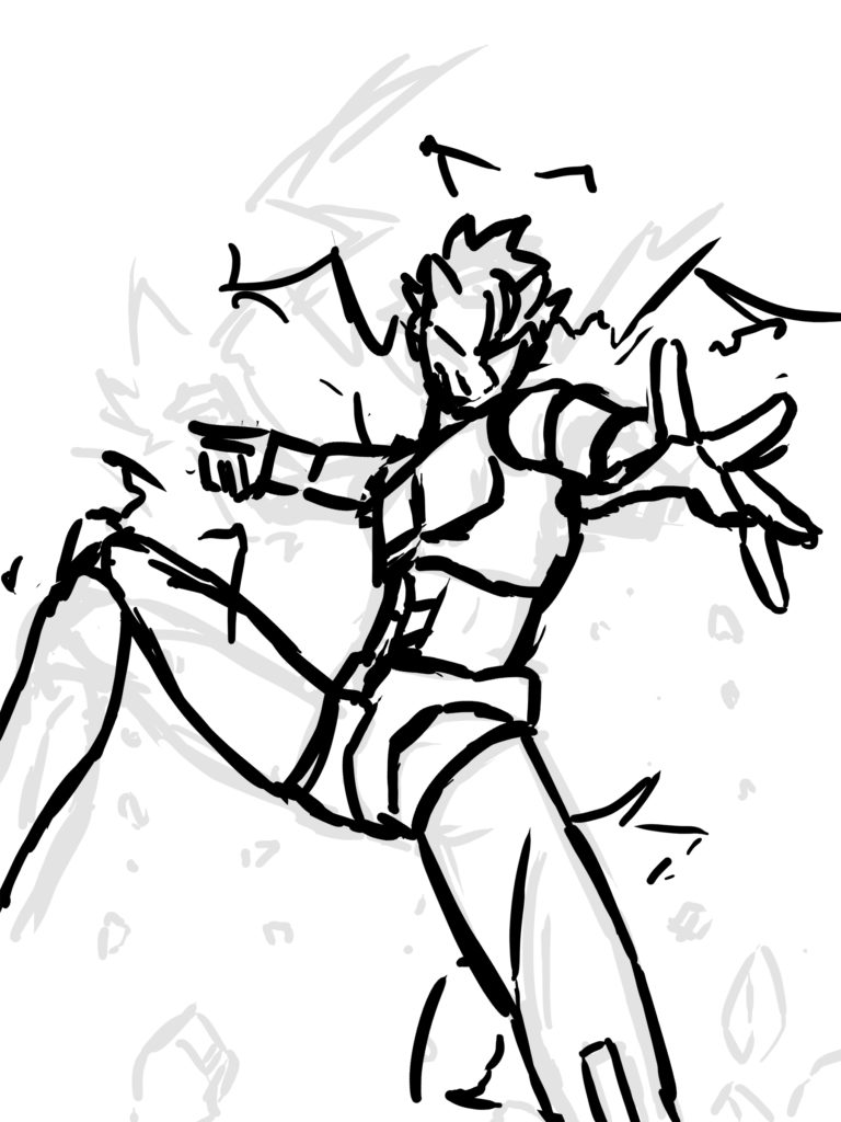
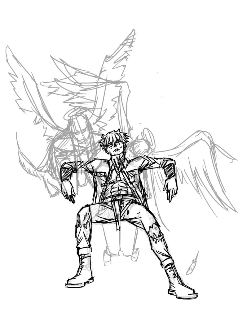
For this composition, I chose to do a character cast oriented sketch that focuses on a group of characters rather than a single subject. This would be a method I would use If I decided to do one poster rather than one for each character as the format has the potential to encompass the gist of an entire story. Drawing it was quite fun, and I took a lot of inspiration from posters I’ve seen In the shops around Akihabara during my research trip to Tokyo. This basic sketch is what I would consider being the opposite of the previous, as it focuses on a single character rather than a cast. What I Like about this format is that it allows for more personality to be shown from each character and can be used to display what each is about in a single snapshot. It further allows gives more opportunity to foreshortening techniques. Marketing wise, Single character posters can cater better to niches within fandoms and may have more sales potential I may think.For my final sketch, I decided to test a more ‘artsy’ feeling composition. A simpler more basic composition that could be useful for the cover art of a book or even a poster aswell. The angle is more direct and leaves room for the application of marketing text compared to the other two. I feel its closer to a simple, American style movie poster format than a one for Japanese IP.