~ Prototype & Elevator Pitch Feedback ~

~Protype feedback~

This week I tested some interview questions, and overall it was not too bad.

What people mostly gave was that my questions need to be a little more focused rather than broad. I was hoping that the questions I created were going to be both broad but focused (if that was even possible). Sadly tho, this was not the case.

Besides that actual questions, the answers that I received were interesting. As the interview when on, people started to realize how annoyed they were getting from just navigating a website. When this started to happen, a light bulb could be seen going off and it made me realize that what I was reading it was true.

Therefore, I need to have a balance of both focused and broad questions to make sure I get the best possible data from people in the future!

~elevator pitch~

Hidden navigation is becoming outdated and hurting the experience of the user. When the navigation is hidden from the user, it brings down the discoverability of the site, e.g. it takes users longer to find information within the site, and the overall metrics, e.g. less time on the page means less money from ads and etc. #BreaktheBurger is my thesis show how badly this element of design is and showing how navigation could look in the future.

Current Pitch

Above is the pitch I tested on people last class, and people had mixed reviews.

Pros:
– under a minute
– easy to understand

Cons:
– no mention of mobile
– longer parts are dry
– hashtag never said before
~ UX Coffee Chat W/ Ira Blossom (UX Researcher @ Google ~

This past Wednesday, I trecked up to New York City to have a cup of joe and participate in a talk with a UX Researcher, Ira Blossom.

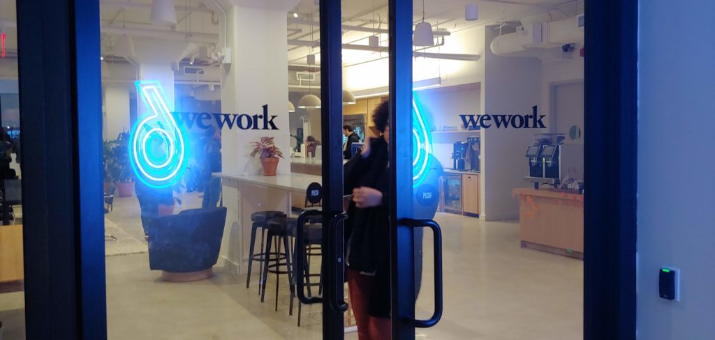
Walking into the weworks communal workspace in New York City.

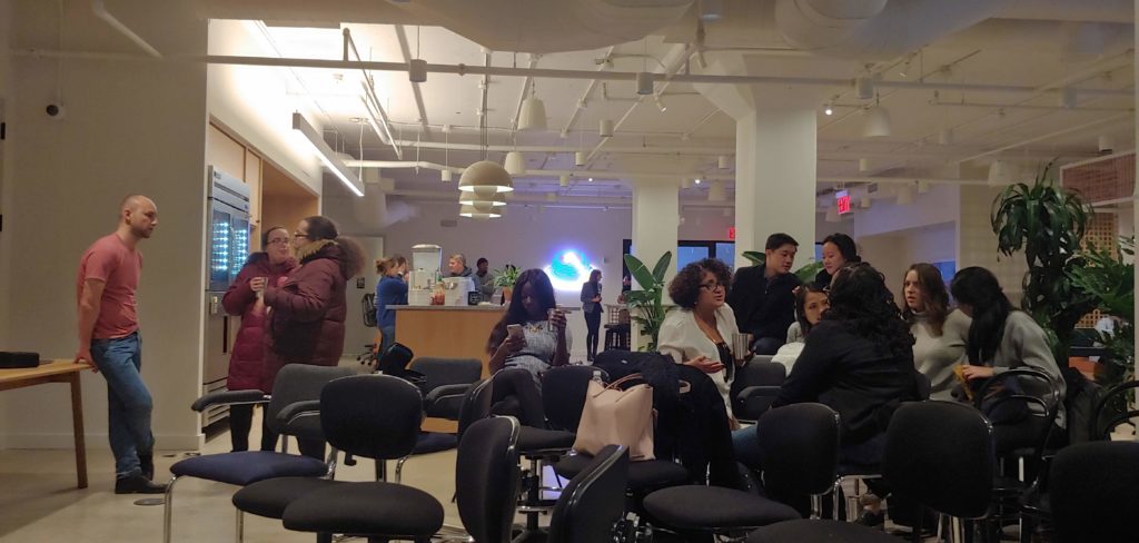
When I arrived at weworks, I happily greeted by Ira himself and to enjoy some coffee and sat down. I looked around and started to talk to people. To my surprise, there were people from all over: Fashion and Project Management just to name a few.

Professionals from other walks of life mingling before the talk.

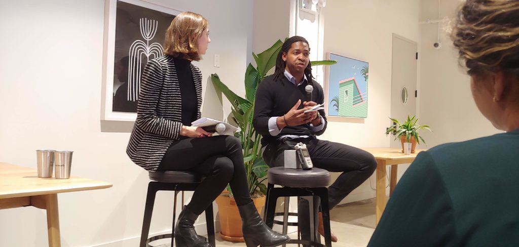
The talk started with the organizer, Courtney Brand, and Ira sat down in front of everyone and began speaking. She began to introduce her self and Ira and started to ask Ira questions about UX and UX Research. The overall mission of this talk was to inform people what is UX and why is it important to have it within design. I was shocked to find out that I was agreeing with what Ira was talking about: UX is much more than just wireframes and the user interface and UX is about answering the questions that no one is really asking.

Courtney Brand (left) and Ira Blossom (right) talking about UX Research.

After listening to this talk and talking to Ira personally after, I forgot about one thing when coming up with a research plan for my thesis: Qualitative and Quantitive data. Yep, that is right. I need qualitative data to count for the human element that involves navigating to better understand how people think when designing new navigation concepts. I need quantitive data to have the numbered data to back up the need for a push in navigation.

From this small chit chat, I have learned a lot for both my thesis and my future career!

~Prototype 2: Feedback~

After reviewing the System Usability feedback, I developed a good idea on how to better this process.

The overall feedback was towards the format of the questions. They seemed one-sided to the desktop rather than about both desktop and mobile. Therefore, this is a better example that I need to make two different SUS’s focus on mobile and desktop.

Besides that, I also need to make the directions more clear to ensure people understand what is asked of them to obtain better results.

~Prototype 1: Notes~

For the first prototype, I went with a simple survey that was created with Google Forms and got great responses!

Coming into class, I was curious to see if people would fully understand the questions and answer them to the best of their ability. Before I allowed people to take it, I quickly added a section where people can place their comments and feedback as soon as they were done. After that, the survey went public and my peers filled it out with ease.

Once people took the survey, they also shared their thoughts about it in a small conversation. Overall the feedback was positive and constructive! My peers suggested that I take account that I should broaden the target audience to the elderly, rather than >25 years for a questions. Another suggestion was to break up the survey into different parts: Mobile and Desktop.

Moving forward, I will take into account what my peers have suggested to better the surveys so I can have accurate and interesting answers!

~Research Update 2~

This week was focused on reading physical books, mainly selections of three: Laws of Simplicity, Emotional Design, and Don’t Make Me Think.

From reading Laws of Simplicity by John Maeda, I have learned that there needs to be a balance of complexity and simplicity. What this means is that when thinking about a solution to the problem at hand, I cannot make the simplest solution that comes to mind. There needs to some type of complexity, i.e. different sections or new concepts, with the design that can balance out the simpler decisions that could be implemented when designing.

Within Emotional Design: Why We Love (or Hate) Everyday Things by Don Norman, talks about how the three-level of emotional design: Visceral (appearance), Behavioral (usability), and Reflective (rationality). Each can be used separately, but when combined correctly, can help design a beautiful user experience. For my purpose, this will help guide me when I am analyzing the collected data to uncover a possible “umbrella problem” that might be causing the failures of hidden navigation. This can also help when designing new concepts by giving new insights to help with ideation.

Finally, Don’t Make Me Think by Steve Krug. This focused on web design and how to ensure your website is user-friendly. It goes in-depth on how people navigate the web today and some helpful tips to ensure the discoverability and pagination are intuitive. This book will help to set some guidelines when it comes to auditing and designing new concepts.

Overall, these books will help throughout my process, from research to designing, to keep both the scope and end goal in check.

~Protoype Plan~

My prototypes are going to be a tad bit different. Since my project is more of a case study on hidden menus, I will be prototyping different data collecting methods. For each week I will come in with two versions of a Questionnaire, System Usability Scales, Surveys, and Interview questions.  The goal for each prototype is to get feedback and suggestions to ensure I can get the best possible data from each method.

Nov. 11

I will bring in two rough designs of questionnaires and surveys and test to see if the questions are clear, concise, and limited in bias. 

Nov. 18

There will be two designs of System Usability Scales (SUS) to test which format and questions will better yield fair and accurate results to see what problem points to focus on. 

Nov. 25

This day will focus on Interview questions and a sample think-a-loud test to see of the questions ad tasks are clear, concise, and will produce good data. 

After each week, each “prototype” will incorporate the suggestions, edits, and criticism from class. Therefore, once each prototype is edited and finalized, I will then start collecting responses and data to start to have some data to organize and analyze. 

~Final Concept~

For my thesis project, I will produce a Case Study on Hidden menus to prove why they are harming the user experience and heuristic metrics of both web and software design. The major difference from this idea from the others is that I truly want to see what results come out of this study and what knowledge can be absorbed during the process. With that said, I personally love this idea because this allows me to understand how people navigate platforms and see if this research can be applied to other aspects of interactive design. 

However, I know this idea is not as attractive sounding than some of the others, but people should be interested because this could answer some questions and spread the word that hidden menus, like the hamburger, are harming the experience and metrics and a push to break this design standard. To differentiate my study from the others that are out there, I am planning to create a new technique for navigation rather than suggesting to use another existing one. 

To implement my project, there will be phases: technically and stylistically. Technically, my project will incorporate user testing, both existing and new designs, and concept websites that displays new navigation techniques. Stylistically, I plan to design a small “pop-up” shop that will educate people on why this is an issue, a need for a change, and insight into what a User Experience process looks like. 

#BreaktheBurger 

~Research Proposal~

Disrupting Navigation: a Hidden Menu UX Case Study 

21th October 2019

OVERVIEW

Hidden menus, like the “Hamburger Menu”, have been used in interaction design for years now, but are harming the user experience of the site itself. Thus, there needs to be a change in how navigation is handled to better the user experience and analytics for the client. 

GOALS

  1. Discover why the hamburger menu is counterproductive.  
  2. Provide good, clear research for future reference 
  3. Test new navigation designs (derived from the research data) 
  4. Report Findings 

Current Issues 

A Brief History 

In 1981, Xerox produced the Xerox Star, a personal computer with a fully functioning GUI. Within the GUI, there was a menu button that had three stacked lines that would reveal a menu upon a click. This came to be known as the Hamburger menu and it was designed by Norm Cox. After the star, the hamburger menu disappeared until Apple revived it in 2007. From that point on, designers have been using this hidden navigation for an easy navigation handling. 

Emerging Problems

People do not like to hear bad news, in this case, how hidden menus are counterproductive to both metrics and the user experience. What are these common problems? Hidden menus:

  • Lack of Discoverability and Navigation 
  • Decrease in web conversions 
  • Inconsistent  use in the Industry 

These problems are known in the design community but are not recognized. Thus, there is no push to change and the use will continue. 

Still in Use Today 

So if these problems are such an issue why is it being still used today? To start off it is easy for the designer to design one menu for multiple platforms. When designing for different screens, a hidden menu is a designer’s dream! The fact that you can design one element and then fiddle with it of different platforms saves time and money. Secondly, trends are more attractive than logic. When people have to think less about completing a task, they are much happier which means the experience is better. Therefore, if something is used all over the internet, like a hamburger menu, it seems intuitive to used that same element. Sadly, this is not the case: something that is used often does not mean they are good. Finally, this method has become a design standard. Since 2007, the hamburger menu is still in use around the internet and that will change until a disruptive innovation in navigation is shared and used. 

Research Methods and Materials  

Methods 
  • Unmoderated & Moderated interviews 
  • SUS ( System Usability Scale) 
  • Surveys and Questionnaires 
  • Heuristic Analysis
  • Competitor audit 
  • User Testing 
Materials 
  • Medium 
    • UX collective 
    • UX Planet 
    • Muzli 
  • Don’t Make Me Think – Steve Krug 
  • The Design of Everything Things – Don Norman 
  • Emotional Design: Why we love (or hate) everyday things – Don Norman 
  • Laws of Simplicity – John Maeda